Assignment 00: One Good Data Visualisation

Find an example of a data visualisation that represents at least two of the principles outlined in Principles of Information Design PDF.
Write some brief notes about:

  • Why you chose this visualisation
  • What makes is a good example in your opinion
  • Which principles does it adhere to
  • Is the visualisation exploratory of explanatory

Post your example with notes in the thread below

Posted

in

by

Tags:

Comments

31 responses to “Assignment 00: One Good Data Visualisation”

  1. Haig Avatar
    Haig

    Ok, I’ll go first. I’ve loved this visualisation since it came out a few years ago.
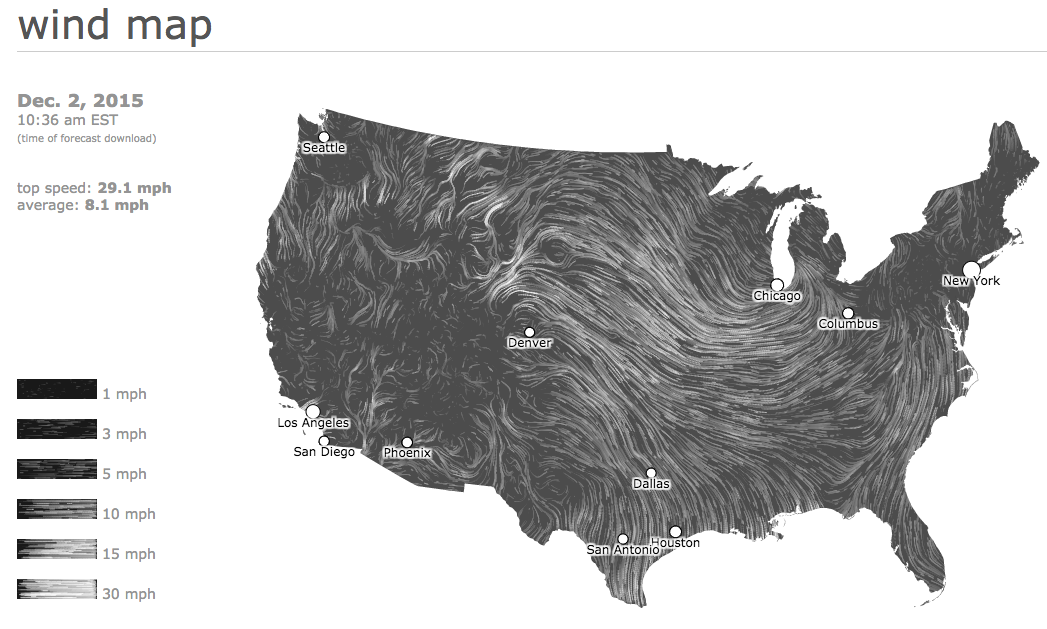
    Wind Map The interactive version can be found here: http://hint.fm/wind/.
    There’s a number of reasons why this is a great visualisation, foremost it’s illustrates Tufte’s micro/macro readings concept and represents multivariant data in realtime in a format this is both easy to understand and beautiful to look at. This is an example of an exploratory visualization, the data it shows can be interpreted in a number of ways.

  2. Catherine Legros Avatar

    I just found this visualization of food trends over the years and seasons, made with Google Search trends: http://rhythm-of-food.net/

    I love the simplicity and playfulness of it, as well as the clear explanation on how to use the tool. I believe it is an example of delightful and accessible data visualization.

    When it comes to principles of information design, it meets many of them. Documentation is at the bottom of the website, causality between search and season is represented, and sometimes explanations behind peaks and peculiarities in the data are annotated. Comparisons are made between the years and between the months. Many readings (macro and micro) can be made, for instance, we can look at one day in particular or at trend patterns over the years. We could also draw conclusions about the rise or fall of vegetables in general in comparison to other food groups.

    I believe the visualization is exploratory.
    (I was not able to add a picture to this comment)

  3. Joakim Avatar
    Joakim

    http://www.informationisbeautiful.net/visualizations/worlds-biggest-data-breaches-hacks/

    This is a visualization of large data breaches, it stood out to me because it very quickly demonstrates just how common and severe data breaches have become, giving an immediate sense of the scale of the problem, as well as illustrating the range of contexts in which data has been compromised.

    I think this is a good example because of its readability as well as allowing users to filter the data in various ways to their liking. This visualization adheres to the principles of multivariate analysis and integration of evidence.

  4. Aimy Qi Avatar
    Aimy Qi

    http://selfiecity.net/
    This is a visualization of investigating the style of self-portraits (selfies) in five cities across the world.
    There’s a number of reasons what makes it a good visualization. First, data of selfies phenomena are visualized in different point of view (gender, location, age…). Second, the data are deeply analyzed and reported in paper on understanding and approach social media images theoretically, which exhibited the significant value of big data and data visualization. Third, the SELFIEXPLORATORY section (http://selfiecity.net/selfiexploratory/) where display data to audiences interactively, that makes the investigation a great example of the combination of data visualization and data interaction.
    This visualization adheres to the principles of Comparisons, Multivariate Analysis, and Documentation.
    I think this visualization is exploratory.

  5. Kevin Avatar
    Kevin

    http://feltron.com/FAR06.html

    A rather famous one. The personal annual report by Nicholas Feltron — this specific one came from 10 years ago. While listing quite some data and information in the document, he inserted two maps (or one map, just with different add-on) at pg. 7 and 11 to showcase restaurants and bars visited throughout the year. Nothing is interactive here, but these two maps are still qualified as data visualization, as they clearly illustrate Feltrons’ moving pattern when it came to dinning outside and offer a peak into this man’s daily life.

    The design of these maps goes along with multiple principles and guild lines listed in Tufte’s document. The graphs offer a pleasant visual experience with strong contract between foreground and background. There is absolutely no redundant decoration, yet Feltron included just everything that is required for readers to get the story. The title of each graph (or the category it belongs to) is located on the following page, which is presented together with the graph when being viewed in printed format.

  6. Nicole Kosin Avatar
    Nicole Kosin

    http://drones.pitchinteractive.com/

    This data shows the amount of victims in Pakistan that got killed or hurt because of the US military drone, practicing to take out enemies without having to sacrifice their military force. The readers can interact with the data for it to show more about the data.

    It is a good visualization because of the amount of documentation provided, such as the articles and where they get the number of people that got killed or hurt. Also, it shows integration of evidence as they provide the place the tragedy occurs, the exact date and number of people that died and got hurt, not only with charts, but with words too, which makes the data easier to read. To add to it, the animation of the data in the beginning shows a good narrative.

    1. Joakim Avatar
      Joakim

      The intro to this visualization is very effective, and the transition of perspective from “attacks” to “victims” helps to delve deeper into the data. My biggest criticism of this visualization is that the colour categorization of “High Profile” and “other” are too similar, making them difficult to tell apart in the bar chart. The “other” label at the top would be more visible if it were nearer to the others on the left side of the screen, as it’s read left to right. Also, I wish the elements of the bar chart that reveal further information also linked to the relevant news story, instead of having all of them in a separate grouping below.

  7. george Avatar
    george

    http://iibawards-prod.s3.amazonaws.com/projects/images/000/000/122/large.jpg?1413040693

    This is a visualization of all fell and found meteorites between 1900 & 2000.
    It consists of concentric circles to represent time and longitude. The weight of the meteorites is shown by the size of the circles, the gaps in each circle has to do with the latitude and the way they have been observed or found is represented with filled and blank circles.
    This visualization also shows how we are constantly searching for meteorites, over the last 100 years, in strategic geographical positions such as Libya, the North and South Pole, the Atlantic and the Pacific ocean.

    What makes this visualization interesting is its exploratory nature, the multi-variant analysis that is provided. We can read the evidence and have a view about a specific region but also about the globe. Although it is designed to be static, it could also be interactive concerning variants like time,latitude and longitude.

  8. Silas Kemble Avatar
    Silas Kemble

    http://www.vox.com/2014/12/29/7463663/twitter-news-2014

    The Year in News

    I found this visualization to be quite compelling as it exhibits statistics consistent with subjects that are popular / current. It functions through Twitter and bases its figures on the number of times that something has been Tweeted about. It is somewhat exploratory and explanatory at the same time in that the results will be always be different depending on when you look at it; a visualization that is completely at the disposal of those operating on Twitter. It is Explanatory in that it gives us a sense of what people are talking about at the moment, I guess the clear cause/effect relationship from tweet to figure is a good indication of its causality.

  9. Jasmine Choi Avatar

    My data visualization maps out how a variety of successful creative people structured their days mapped out by activity groups in a period of 24 hours. The bars are coloured for general headings of activity but you can also hover over each specific bar to find out the exact details of what that specific person was doing.

    I think the visualization is visually appealing, interactive, and easy to understand. It is explanatory in that it gives you a bunch of information about how people structured their day, but also exploratory because you can use that information to create a story and to compare the different people to make inferences about what certain day-structures will do to help a certain type of creativity.

    https://podio.com/site/creative-routines

    1. Anna Heib Avatar
      Anna Heib

      After exploring the visualization for a bit, I find it offers a lot despite while being on the more simplistic side. The informations are a little static and need the readers engagement. But once you interact and look for interactive areas, a lot of additional informations are offered.
      I really enjoy that the order the people are presented is based of how early they wake up. That offers up interesting connections and comparisons.

      A similar (in content) graphic popped into my mind that is often referenced on the “brainpickings” blog. It’s very interesting how different the displayed infographics compliment / are different from each other.

      Maria Popova / Accurat/ Wendy MacNaughton:
      https://i1.wp.com/www.brainpickings.org/wp-content/uploads/2013/12/sleepproductivitywriters_1500_1.jpg?ssl=1

  10. Zora Trocme Avatar

    http://lisacharlotterost.de/GoogleSearchHistory.pdf This is Lisa Charlotte
    This is a data visualizations of Lisa Charlotte Rost’s google searchers from 2010-2016. I chose it because visually it’s beautiful, the data and how it was collected is also stunning. Google keeps these analytics on every single persons web searches tied to their account and makes it accessible to them, but very few people know just how accessible its is. I like that she’s selected google searches that relate to physical places, correlating it with time and where she physically was. Whats really great about this data visualization is it breaks up number of searches week by week, but then pools them into an overall number; she then uses that data to map out where where she actually lived to determine the scale of the line. What also make this great is how much explanation she has written on top of it, this visualization does not make us guess whats going on, it explains trough words and pictures. This visualization shows: comparison, causality, multiple variants, evidence, and has documentation (linking you to where you can see all your tracked searches associated with you). I think this visualization is exploratory and explanatory.

    {relevant for the course:
    https://lisacharlotterost.github.io/2016/05/17/one-chart-tools/
    https://groups.google.com/forum/m/#!topic/d3-js/zHcH-FIEroE}

  11. Maggie Bouchard Avatar
    Maggie Bouchard

    We Feel Fine

    http://www.wefeelfine.org/movements.html
    http://www.wefeelfine.org/patience.php?is_mac
    (I’ve attached the video link because Java blocks the use of the site now and I cannot figure out how to block it…)
    https://www.youtube.com/watch?v=Lotjo64R-eo

    I thought this visualization was intriguing because it essentially presents a bird’s eye view of what the world is feeling. The feelings are interpreted from online blog postings and organized according to the tone of the emotion – positive feelings are yellow, negative feelings blue, etc. You can draw your own conclusions and make comparisons based on the colors, time of day, geographical region, even infer based on real-world events. You’re also given the opportunity to click on specific “feeling bubbles” to get a closer look at what was actually posted. I think it’s visually-appealing and a tad overwhelming – a detail that I appreciate since trying to wrap your brain around the fact that billions of different people are all feeling something different right now should be overwhelming. I think it’s approachable and exploratory, multiple variables are presented to provide some level of context, and the original blog postings are documented and evidenced in an accessible manner.

  12. Kushal Goenka Avatar

    Based on a True True Story?
    Scene-by-scene breakdown of Hollywood films
    http://www.informationisbeautiful.net/visualizations/based-on-a-true-true-story/

    This data visualization about the truthfulness of scenes in Hollywood films really caught my attention, as it does a really good job at providing users with an exploratory platform to learn about their the films they’re curious about on various levels. From getting a general sense of how accurate a movie is, to getting a more in-depth reading of what the user themselves may consider relevant data and make up their own minds.

    I find this to be a fascinating topic. In a post-truth era, fact checking is becoming increasingly relevant and important and this visualization succeeds in engaging audiences through a simple yet customizable look at the data.

    Principles being followed include ‘Integration of Evidence’ as this interactive visualization does a great job of mapping the scenes from the movies directly into the graphs they’ve created. They also provide various ways of looking at the information and ways to change perspectives to minimize bias. Along with that, the visualizations do a good job of following the principle of ‘Comparisons’ by putting scenes as well as movies in close proximity to give the viewers a visual intuition of what they’re looking at without even needing to dive into the numbers.

    I would consider this visualization exploratory as it simply lays out the facts in an approachable fashion, and the audience can form specific conclusions based on their interaction with the provided data.

  13. Anna Heib Avatar
    Anna Heib

    Jonathan Harris – The Whale Hunt (2007)
    http://number27.org/whalehunt
    http://thewhalehunt.org/

    My data visualization is somewhat between categories, but that is probably why I like and enjoy it so much. Jonathan Harris himself describes it as „an experiment in human storytelling“. I would describe it as a stunning and compelling interactive visualization of a highly subjective data / metadata set that makes it possible to tell several stories within one overarching one, inviting you to participate and explore.

    Jonathan Harris collected the data/metadata during a nine day trip to Barrow (Alaska) observing the tradition of the Inupiat whale hunt that provides the community’s annual food supply.
    His photographic documentation is made of photos taken in 5 minute intervals (also during sleep) that establish a „photographic heartbeat“ that rises during moments of high adrenaline (37 pictures per 5 minute).
    The online interface of the visualization makes it possible to filter and explore the dataset of 3,214 pictures through different filters of time, concept, context and cadence(heart rate, level of excitement).

    It is definitely an exploratory data visualization that makes a multivariant analysis possible, comparing and documenting the artists reaction throughout the unfolding story. The highly subjective collection of data interests me. Where are the boundaries of what is considered a „data set“?

  14. Sophy Xie Avatar
    Sophy Xie

    http://www.peiliew.com/n3d

    This experimental project is an example interactive data visualization – it’s a hypothetical project, I don’t think it’s actually implemented or in use. The designer Pei Liew took a clunky and text heavy website NED – a catalog of all known objects in extragalactic space. Liew took 40,000 data points and translated it into a three dimensional graph. It is easy to visualize the individual galaxy and its neighbouring environment in this map.

  15. Nate Claus Avatar
    Nate Claus

    http://www.poppyfield.org/
    Developer: Valentina D’Efilippo (Featured in The Infographic History of the World by HarperCollins, 2013)

    I chose this specific visualization because it thoughtfully and directly represents data.

    This interactive visualization explores the 20th century wars. It compares death tolls, when and where events occurred, and a war’s overall duration. Color represents the location. Length and height represent time and duration.

    The visualization compares most 20th century wars directly giving a better sense of scale using beautiful graphics. It uses multivariate analysis and comparison to do this while also using an implied causality on the topic of war.

    Is the visualization is mostly explanatory as it gives you direct data in the shape of various forms, however, lets you explore the timeline and scope of the visualization

  16. susan yu Avatar

    Notepad is a design of Matt Kenyon and  Douglas Easterly that is an art object and also a work of critical design. It looks like an ordinary office notepad until you look through a magnifying glass. You then begin to interact with the information on the pages, which is the names of more than 100,000 Iraqi civilians who died in the Iraqi War. The interaction and the meanings are on several levels.

    First, the viewers are interacting through their eyes and their fingers as the read the names. Second, there is a contrast between the innocent notepad and the terrible contents. Third, there is a comparison between the names of the dead civilians in the notepad on a micro level and the names of the dead soldiers on a standard war memorial on a macro level. Fourth, there is a comparison or contrast between the innocent notepads and the critical comments the contents will make when they go into US government offices for use. Finally, there is a statistical comparison between the small number of soldiers who died and large number of civilians who died.

  17. Bing Zhang Avatar
    Bing Zhang

    http://flowingdata.com/2015/12/15/a-day-in-the-life-of-americans/

    A day in the life of Americans is a interactive data visualization that stood up to me. The playfulness and movement make this data fun to watch and learn. By using dots to represents people and color represents various activities, it quickly demonstrate American average day life.

    The data visualization is fitting to multiple principle and guideline listed in Tufte’s document. The visualization uses the data to tells a story around American people daily life. It implement time and activities variables to help provide the context.

  18. Claudia Hopkins Avatar

    https://www.behance.net/gallery/42795957/La-legge-bavaglio-raccontata-dai-giornali

    I found this data vis interesting, as it plays around with data visualization versus an infographic. I think they are enriching the infographic form by providing data that using exact numbers and data sets (no approximations), but organizing it on a single page like an infographic. Unfortunately, I can’t understand the language or decode it.

    http://www.datasketch.es/october/code/nadieh/
    Best viewed on Chrome.
    This data visualization is really beautiful, and is a multivariate analysis. The lines show what the relationship is, and the colours show degree of separation. When clicking on two names, you can see how the royals are connecting across the world. The topic isn’t that enthralling necessarily, but I think the amount of data is impressive for such a stunning visualization. I think some of it is self explanatory as you can understand the relationships well, but the colours are less so. I think this makes people spend more time figuring it out, reading the documentation, etc.

    I really enjoyed their blog as a whole – http://www.datasketch.es

  19. Brittany Garuk Avatar

    https://stamen.com/work/airbnb/

    I chose this data visualization/map combo by Stamen because I think it tells a story about how Airbnb has changed the composition of neighbourhoods in big cities since its inception in 2008. The data visualization provides contextual information to the map sequences. It provides clear information: top 50 Airbnb cities (highlighting top 18 cities), relative volumes of travel between cities, and orders the cities based on geographic location. The data visualization has a hierarchy that draws the viewer in by providing easy to understand info (city names), then drawing them in to figure out the more complex part (relationships between cities). Only 6 clarifying sentences are needed to preface the data visualization which speaks to it’s readability & utility.

    The comparison being made by the data visualization is between the company’s top 18 and top 50 cities. The maps are comparing the amount of Airbnb usage in certain areas of NY and SF over time. The data viz/map combo shows causality because it points to the most desirable places to rent out on Airbnb in cities that are known for having changed since this has happened. The purpose of this is to make the viewer think about how many big cities have changed (for worse?) since their neighbourhoods have become filled with temporary neighbours. There is multivariate data being used including time, location-names, volume of travel, amount of Airbnb listings, and location-neighbourhoods. The city names use a visual hierarchy to differentiate between the top 18 Airbnb cities and top 50 through text colour and size.

    I would say this is a explanatory visualization because it provides evidence to an argument about the impact that Airbnb is having on neighbourhoods & cities.

  20. Adan Lemus Avatar
    Adan Lemus

    http://armsglobe.chromeexperiments.com/

    I found Google’s data visualization of the global gun trade to be extremely interesting, as it is fully interactive and has found a very playful and mesmerizing way to display its collected information. It shows very clear comparisons throughout the visualization, like imported weapons vs. exported weapons while also displaying multi-variant analysis on variables such as geographical location, year, etc. Now, you’ll have to pardon my french but, this one is pretty dang cool to play with despite it being pretty morbid information, in my opinion.

  21. lisa Avatar
    lisa

    i often cringe at 3d graphs — but this is one rare and special case where i think it works because you can navigate through the graph.

    https://www.nytimes.com/interactive/2015/03/19/upshot/3d-yield-curve-economic-growth.html

    and for music lovers here’s another one i love:
    https://research.google.com/bigpicture/music/#

  22. shiwei song Avatar
    shiwei song

    https://www.theguardian.com/environment/ng-interactive/2014/dec/01/carbon-emissions-past-present-and-future-interactive

    This interactive data visualization is quite interesting and fit into the on-going issue of global carbon emissions. It clearly shows the past, present, and future of each countries about their carbon emissions. By using interactive data visualization, it turns into a straight forward graphics with lots of data, and it makes viewers easy to understand and observe the trend of global carbon emissions. Which can be a great tool for kids and people who don’t know much about carbon emission issue and the challenge we are facing now.

  23. monika litzinger Avatar
    monika litzinger

    http://wikiverse.io/

    Wikiverse is represented Wikipedia as space. The individual articles are stars and planets. Stars are clustered together according to their hyperlinks, forming solar systems, star clusters, and galaxies of related concepts. You can zoom in and out in the 3D space and you will find unexpected connections between the topics.
    You are able to compare topics or different articles. The visualization is aesthetically beautiful, valuable in terms of content and fun to interact with.

  24. Brigit Sterry Avatar
    Brigit Sterry

    https://pudding.cool/2017/01/making-it-big/

    The Odds of Making it Big reveals the vast contrast of bands who ‘make it big’ to those who do not. It shows 75 000 bands that played small venues in New York over the past 3 years, then gradually decreases the number of bands in the pool depending on success until 21 are left. According to the data represented in this explanatory visualization, only these 21 of 75000 bands made it big. Although I find the first the most interesting, there are subsequent visualizations on each band’s rate of success and so on.

    I think the first visualization is particularly interesting as it is plays out as a narrative, decreasing the pool of bands as the user scrolls down. This idea is emphasized by the use of numbers to show bands at the beginning, and unique identities at the end. While the subsequent visualizations give us more insight into the data, the first one effectively uses comparison to emphasize the message, that being that only a tiny number of artists ‘make it big’.

  25. Vivian Chen Avatar
    Vivian Chen

    https://qz.com/994486/the-way-you-draw-circles-says-a-lot-about-you/

    I picked this data visualization created by Quartz using Google’s game called Quick, Draw! which was released to collect drawings to create algorithms of how humans draw. The visualization analyses the different ways people from different countries draw circles – e.g. whether they draw counter-clockwise, or clockwise. I chose this data visualization because it is very informational, and the article makes a link between the circles and cultures which I found to be interesting.

    Comparisons are made between the way the circles are drawn and the country that the drawer originates from. This shows a causality of how culture and language can affect the way we draw. The data source is provided by Google’s own game, which is very credible.

    This is exploratory because the way that people draw circles can be attributed to different factors, not limited to language.

  26. Amelia Koster Avatar
    Amelia Koster

    It’s hard to choose between the data visualizations of Jer Thorp (he’s got a couple great one’s on his website blog.blprnt.com)

    http://blog.blprnt.com/blog/blprnt/two-sides-of-the-same-story-laskas-gladwell-on-cte-the-nfl
    This is a cool example of a quick, lightweight project he made. It’s an interactive, multi-variant visualization that’s exploratory & thoughtful, reflecting on the similarities and divergences of 2 versions of one story (something I’ve never seen done in a data visualization before). As with many of Thorp’s works, it’s surprising content, presented in a beautiful and legible way. I think good data viz should uncover something unexpected, and make the viewer reflect on an element of information that they maybe wouldn’t have. It’s an interesting way to start to make people reflect on biases in articles– to think about the editorial decisions writers make and why.

  27. Britt Williams Avatar
    Britt Williams

    http://informationisbeautiful.net/visualizations/snake-oil-scientific-evidence-for-nutritional-supplements-vizsweet/

    Most of us have a desire to be healthy, to pick the right foods, and to do what’s best our bodies. Sometimes I find myself overwhelmed at the grocery store because there is so much information pollution surrounding diet and the foods we eat, that I’m not sure what I should be eating. I like this example because it is using data as a way to help people navigate their health and buying decisions. I’m going back and forth between whether I think this example is exploratory or explanatory. I think it is more exploratory, because it isn’t trying to say “this is definitively what you should be eating” rather it is visually communicating which supplements have the most evidence to back them up. The example is multi-variant; the viewer is able to sort the information a number of different ways, including by popular interest, type, evidence and scientific interest. The example is also documented well, as you can easily access the sources of where the designers got their information from. I think this is especially important when the data that’s being included is from scientific studies, because it’s important to be able to check the authenticity of the study.

  28. Sandra Han Avatar
    Sandra Han

    http://drones.pitchinteractive.com/

    This is a great example of data visualizaiton in my opinion because it has really good pace when telling the story. Especially with such an intense/scary subject, this makes it that much more effective in a way where people can really let the information sink in. Similarly to how when people do public speaking, they make long pauses for an effect.

    It’s effective because it uses colours to separate the pieces of data as well as a changing progress bar over the course of the years. You can also hover over the pieces of data to get more information on it.

    This is an explanatory visual.

Leave a Reply to Brittany Garuk Cancel reply

Your email address will not be published. Required fields are marked *